The first topic to address is system visibility.
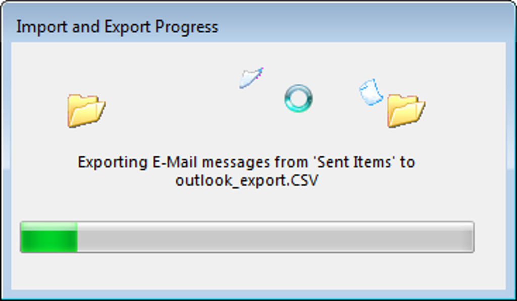
The system must always inform the user of progress through timely and appropriate feedback.
For example, indicating how much battery is left on a phone or laptop, notifying unread email counts, showing the next stop in public transport, and when the next vehicle is arriving are all ways that allow precise recognition of the current system state.

1. Knowledge is power.

Just knowing the current state of the system can lead to better situations. Users can overcome various trials and errors by checking the system's status and figuring out what tasks need to be done next.
For example, when driving a car, one must continually check the speedometer to decide whether to speed up or slow down.
Those who have driven a car with a broken speedometer know how difficult that situation can be.
In such cases, the driver must watch the speed of surrounding cars and cleverly maintain and adjust their speed.
Lack of information often limits user behavior.
2. Appropriate Feedback
Users must know whether each interaction with the system is successful. When a button is pressed, it must be clear whether the system has acted upon that press or if it has failed. Has the item been added to the shopping cart? Has my form been submitted? (Users ask these questions because they have previously experienced a lack of feedback. Even on a perfect day when everything works flawlessly, people will wonder if their actions have been properly communicated.)
Appropriate feedback on user actions is perhaps one of the most basic guidelines in user interface design. Informing users of the current status can help adjust interactions in the right direction without wasting effort. Such feedback can be as simple as changing the color of a button after it is clicked or displaying a progress bar if the process needs a little more time. This feedback indicates that the system is in operation and prevents users from pressing the same button multiple times.


If the system doesn't have a screen and the user can't see the effect of their actions (as is the case with voice-only devices like Amazon Echo and Google Home), then at least some feedback that the device is listening to commands is essential.
Amazon's Echo displays a ring of light on the device to indicate that it is currently listening or working on a command.
This on-off type of indication at least lets the user know that the system has heard and executed the command.

3. Encouraging User Action
The systems we create in our apps, websites, and products are very complex, and it's unreasonable to assume that all variables describing the system's status are communicated to users. Additionally, backstage components such as downloading and executing JavaScript files for site operation may not seem important to users—most users are not even interested in such structures.
Nevertheless, the backstage sometimes plays a crucial role.
For example, consider inventory management during shopping. Typically, the total stock a company holds is monitored for operational purposes and not displayed to users.
However, there are exceptions:
- When stock is low: Knowing that only a few items are left can prompt immediate purchases based on current need or social influence.
- Out-of-stock items: This information can reduce efforts to add products to the shopping cart that are no longer available.
Preventing orders that cannot be fulfilled is better than allowing users to go through the selection and checkout process only to find out that the item is out of stock. The impact of a failed order is significant as it can lead users to abandon the purchase altogether.
Notifications and modal dialogs are typically used to convey backstage events that could affect users.
Communication builds trust.
In human relationships, secrecy or unilateral decisions can lead to a loss of trust and an unequal relationship.
The same is true when interacting with systems.
Knowing what state the system is in helps users feel they are acting correctly and that the system is functioning as expected. Being able to predict interactions not only builds trust in the structure and operations of the site or app but also in the brand itself.
Websites and apps must clearly communicate the system's status to users and should not take actions without informing them. When the system's status changes due to external events or over time, it should be explained to users in a way that is easy to understand.
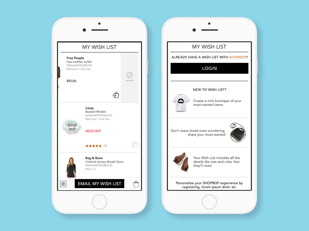
Taking the example of a shopping mall, what happens when a user revisits their wishlist only to find that products have been discontinued or are out of stock?
The worst user experience occurs when items disappear from the list without explanation, stripping users of the ability to make informed decisions and reducing trust. This could lead users to stop using the wishlist feature.
A better way to build trust is to explicitly communicate the current status of unavailable items, then allow users to remove them from the list themselves or mark them for later viewing. Designing the purchase button to be disabled and displaying 'Sold Out' helps users understand why they cannot make a purchase and allows them to delete items themselves.

Conclusion
The visibility of the system's status is a fundamental principle of great user experience. The essence of this heuristic encourages open and continuous communication, foundational to all relationships, whether between people or between people and systems. Without information on the system's current state, users cannot decide what actions to take next to achieve their goals, nor can they know whether their actions are effective or mistaken.
So, let's not blindfold our users!
'Eng > UX&UI' 카테고리의 다른 글
| Figma AI: A New Paradigm in Design (0) | 2024.07.03 |
|---|---|
| [UI/UX] (5)Consistency and standards (0) | 2024.04.26 |
| [UI/UX] (4)User control and freedom (0) | 2024.04.25 |
| [UI/UX] (3) Match between system and the real world (0) | 2024.04.22 |
| [UI/UX] (1) User Interface Design - 10 Usability Heuristics (0) | 2024.04.18 |


